Images
Wrapper utilities for sizing images with the aspect-ratio property, can be applied to individual containers for single images or a grid container for multiple images. Disabled by default, enable with $enable-images: true; in the _configuration.scss document.
Single image wrappers (anchor)
The examples below apply the utility classes to a single image using the <figure> element with the names of each utility provided in the figure captions.
.auto
.landscape
.landscape-sm
.landscape-xs
.passport
.portrait
.portrait-smExample HTML
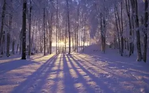
<figure class="auto">
<img src="/img/docs/winter-forest-300.webp" alt="Snow covered clearing in forest with shadows from sunlight filtering through distant tall trees" width="300">
<figcaption><code>.auto</code></figcaption>
</figure>

<figure class="landscape">
<img src="/img/docs/winter-forest-300.webp" alt="Snow covered clearing in forest with shadows from sunlight filtering through distant tall trees" width="300">
<figcaption><code>.landscape</code></figcaption>
</figure>

<figure class="landscape-sm">
<img src="/img/docs/winter-forest-300.webp" alt="Snow covered clearing in forest with shadows from sunlight filtering through distant tall trees" width="300">
<figcaption><code>.landscape-sm</code></figcaption>
</figure>

<figure class="landscape-xs">
<img src="/img/docs/winter-forest-300.webp" alt="Snow covered clearing in forest with shadows from sunlight filtering through distant tall trees" width="300">
<figcaption><code>.landscape-xs</code></figcaption>
</figure>

<figure class="passport">
<img src="/img/docs/winter-forest-300.webp" alt="Snow covered clearing in forest with shadows from sunlight filtering through distant tall trees">
<figcaption><code>.passport</code></figcaption>
</figure>

<figure class="portrait">
<img src="/img/docs/winter-forest-300.webp" alt="Snow covered clearing in forest with shadows from sunlight filtering through distant tall trees">
<figcaption><code>.portrait</code></figcaption>
</figure>

<figure class="portrait-sm">
<img src="/img/docs/winter-forest-300.webp" alt="Snow covered clearing in forest with shadows from sunlight filtering through distant tall trees">
<figcaption><code>.portrait-sm</code></figcaption>
</figure>
Grid gallery (anchor)
If the grid utilities are also enabled the aspect-ratio modifiers can be applied to a wrapper element to resize all images within a grid making it useful designing gallery orientated content.
Example HTML
The images used all vary in height but share a common width of 480px. The container uses the auto grid modifiers replacing the default .grid utility name for the aspect-ratio modifier class.
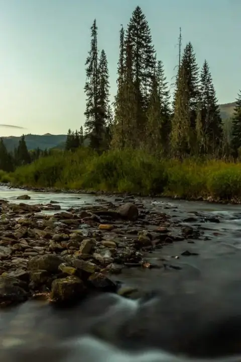
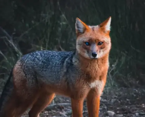
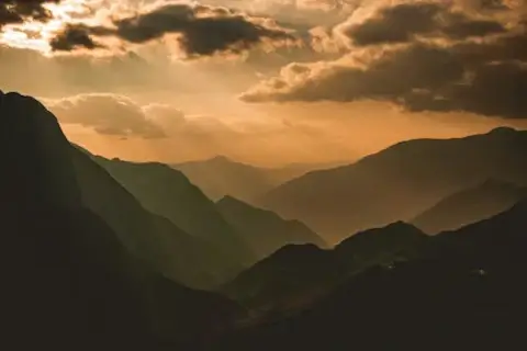
<div class="passport g-4 g-2-sm gap-3 mb-3">
<img src="/img/docs/rocky-stream-480.webp" alt="A rocky stream next to a small copse of pinetrees on a grassy bank">
<img src="/img/docs/red-fox-480.webp" alt="A red fox with one eye blue and the other brown looking directly at camera">
<img src="/img/docs/hazy-mountains-480.webp" alt="View of distant mountains and valleys scenery bathed in hazy sunlight">
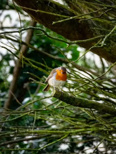
<img src="/img/docs/bird-on-branch-480.webp" alt="A small white and brown bird with orange chest colors sitting on a tree branch">
</div>Inline styling (anchor)
The aspect-ratio for the utilities are provided by a CSS variable that can be used to customize the ratio inline, it can be used to adjust any of utility classes above to individual images and/or on the grid wrapper to be applied to all images.
--aspect-ratio: 5 / 1;
--aspect-ratio: 5 / 2;
--aspect-ratio: 5 / 3;Example HTML
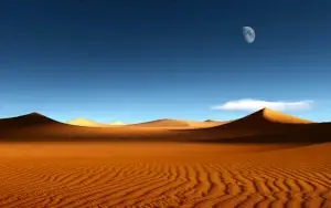
<figure class="auto" style="--aspect-ratio: 5 / 1;">
<img src="/img/docs/desert-300.webp" alt="Sand dunes in desert with blue sky background" width="300">
<figcaption><code>--aspect-ratio: 5 / 1;</code></figcaption>
</figure>

<figure class="auto" style="--aspect-ratio: 5 / 2;">
<img src="/img/docs/desert-300.webp" alt="Distant sand dunes in desert with blue sky background" width="300">
<figcaption><code>--aspect-ratio: 5 / 2;</code></figcaption>
</figure>

<figure class="auto" style="--aspect-ratio: 5 / 3;">
<img src="/img/docs/desert-300.webp" alt="Wind rippled desert sands with distant sand dunes with blue sky and moon in background" width="300">
<figcaption><code>--aspect-ratio: 5 / 3;</code></figcaption>
</figure>
Customize (anchor)
The image styles can be customized in the _image.scss document in the [styles/utilities] directory, they're written as standard CSS with limited Sass functionality included for compiling purposes.
Styles
//  ------------------------------------------------------------
//  Images
//  ------------------------------------------------------------
@use "../../configuration" as *;

@if $enable-images {

.auto, .passport, .landscape, .landscape-sm, .landscape-xs, .portrait, .portrait-sm {
  display: grid;
  grid-template-columns: var(--gtc);
  max-inline-size: var(--width);
}

:where(.auto, .passport, .landscape, .landscape-sm, .landscape-xs, .portrait, .portrait-sm) img {
  object-fit: cover;
  aspect-ratio: var(--aspect-ratio);
  height: 100%;
}

.auto {
  --aspect-ratio: auto;
}

.passport {
  --aspect-ratio: 1 / 1;
}

.landscape {
  --aspect-ratio: 16 / 9;
}

.landscape-sm {
  --aspect-ratio: 3 / 1;
}

.landscape-xs {
  --aspect-ratio: 4 / 1;
}

.portrait {
  --aspect-ratio: 3 / 4;
}

.portrait-sm {
  --aspect-ratio: 4 / 6;
}

} // END [if/images]